# Flexbox
- flexboxfroggy.com - GAME (opens new window)
- A complete Guide to Flexbox - CSS-Tricks (opens new window)
- CSS Flexbox - w3schools (opens new window)
- Flexbox - MDN (opens new window)
- flexbox.help (opens new window)
- Flexbox Generator (opens new window)
- A visual Guide to Flexbox Properties (opens new window)
- Flexbox Playground (opens new window)
- use-flexbox-to-create-a-sticky-header-and-sidebar-with-flexible-content (opens new window)
- Easiest Flex-Grid ever (opens new window)
- flexbox.io (opens new window)
# Flexbox Basics
In flexbox, the outer box is called the container. The inner boxes (the columns) are called the items. Any element can be a flex container.
The flex container (parent) becomes flexible by setting the display property to flex: display:flex or display:inline-flex
div.container {
  display: flex;
}
In the example above, all divs with the class container are flex containers. If they have children, the children are flex items.
- A div with the declaration
display: flex;will remain block level — no other elements will appear on the same line - But it will change the behavior of its child elements: Child elements will not begin on new lines.
display: inline-flexcreates flex containers that are also inline elements -> allows multiple flex containers to appear inline with each other.- if the content doesn't fit, the parent will grow
- all elements have the same size, if they all have
flex-grow:1 - Step 1: make Item as small as possible, Step 2: try to apply grow
- all flex items shrink proportionally when the flex container is too small.
- If a
max-widthis set for an element, it will not grow larger than that even if there is more space - Flex containers can be nested inside of each other by declaring
display: flexordisplay: inline-flexfor children of flex containers.
# Flex Container properties :
# flex-direction (opens new window)
- defines in which direction the container wants to stack the flex items (is used to specify the main and cross axes). By default, the main axis is horizontal (row) and the cross axis is vertical.
- Values: row (default), row-reverse, column, column-reverse
- The main axis is used for:
justify-content, flex-wrap, flex-grow, flex-shrink. The cross axis is used for:align-items, align-content
# flex-wrap (opens new window)
- specifies whether the flex items should wrap or not. (shift along the cross axis if the flex container is not large enough)
- Values: wrap, nowrap (default), wrap-reverse
# flex-flow
- is a shorthand property for setting both the flex-direction and flex-wrap
flex-flow: direction wrap;
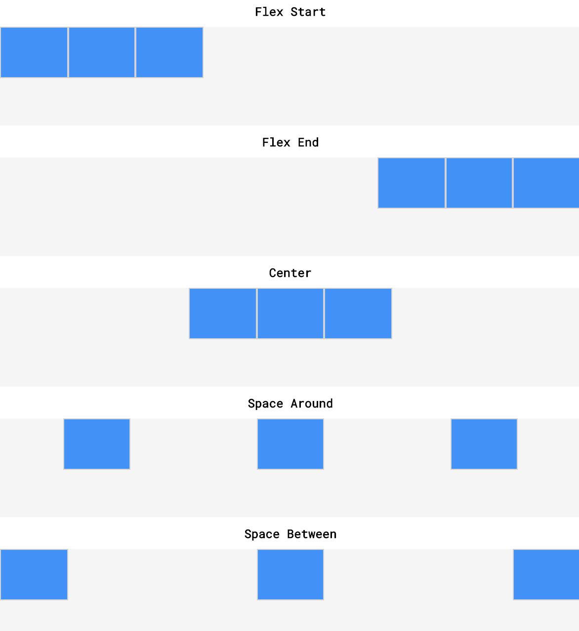
# justify-content (opens new window)
- used to space items along the main axis - (horizontally from left to right).
- The size of each item is not changed.
- Values: center, flex-start (default), flex-end, space-around (equal space before+after items), space-between (equal space between, no extra space @start/end)
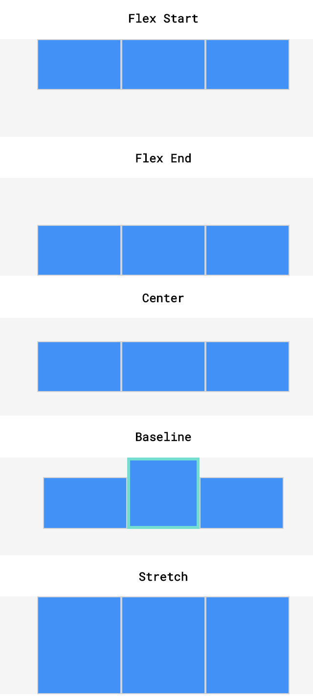
# align-items (opens new window)
is used to space items along the cross axis (vertically). (within a single row)
Values: center, flex-start, flex-end, stretch (default), baseline (bottom aligned with each other)
* stretch: elements with a specified height will not stretch; elements with a minimum height or no height specified will stretch).
# align-content (opens new window)
- If a flex container has multiple rows of content, we can use align-content to space the rows from top to bottom.
- It is used to space rows along the cross axis.
- Values: flex-start, flex-end, center, stretch, space-around (equal space), space-between (equal space except start/end)
** stretch: if a minimum height or no height is specified*
# Flex Item properties:
The direct child elements of a flex container automatically becomes flexible (flex) items.
# order (opens new window)
- specifies the order of the flex items.
- The order value must be a number, default value is 0.
# flex-grow (opens new window)
- specifies how much a flex item will grow relative to the rest of the flex items if there is space.
- The value must be a number, default value is 0.
- Margins are unaffected by flex-grow and flex-shrink. minimum and maximum widths will take precedence over flex-grow and flex-shrink
# flex-shrink (opens new window)
- specifies how much a flex item will shrink relative to the rest of the flex items. The value must be a number, default value is 1.
- flex-shrink will only be employed if the parent container is too small or the browser is adjusted
# flex-basis (opens new window)
- specifies the initial length of a flex item before it stretches or shrinks.
- similar to
width. ifflex-direction: column: flex-basis=height- We can think of flex-basis as the width OR height (depending on flex-direction)
- flex-basis is limited by both max-width/max-height and min-width/min-height
- When declared, flex-basis will override the width/height property set on a flex container
- If no flex-basis is specified the default is the set width/height value, if width/height isn’t specified the default is the width/height of the content
- When there is not enough space for our flex items our items will shrink at an even rate to fit within the container by default
- If there is too much space we can declare flex-grow: 1; on our flex items to make them grow at an even rate
# flex (opens new window)
- is a shorthand property for the flex-grow, flex-shrink, and flex-basis properties.
flex: grow shrink basis;
# align-self (opens new window)
- specifies the alignment for the selected item inside the flexible container.
- It overrides the default alignment set by the container's align-items property.