# Units
- CSS Units - w3schools (opens new window)
- CSS Values and Units - MDN (opens new window)
- When to use rem vs em (opens new window)
- Understanding the Difference Between CSS Resolution and Device Resolution (opens new window)
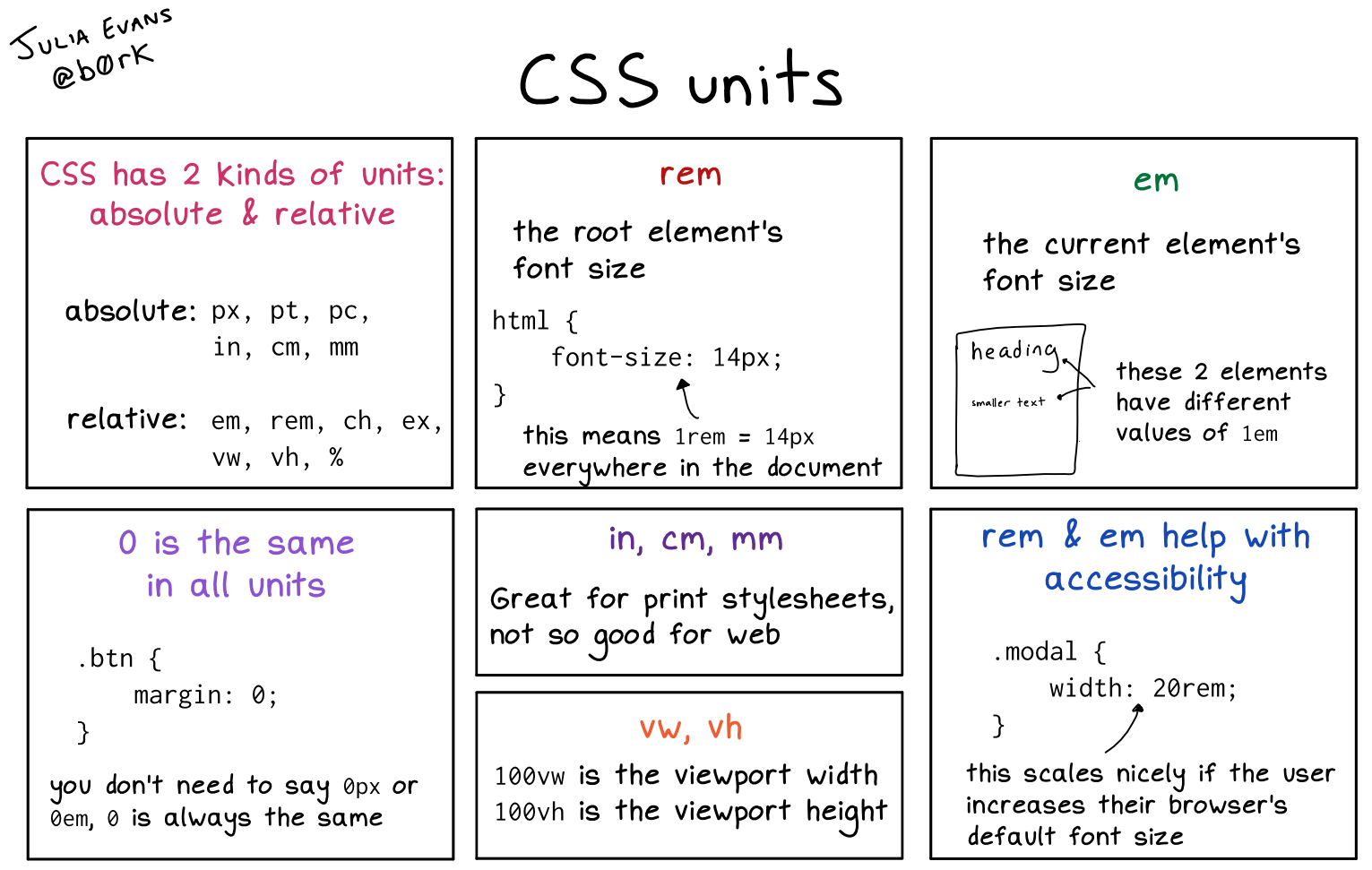
# Absolute Units
| Unit | Description |
|---|---|
| px | pixels |
| pt | points |
| pc | picas (apc = 12 pt |
| cm | centimeters |
| mm | milimeters |
| in | inches |
In web development, you usually use px for height and width, and pt for font-size.
Pixel values (px) actual size on the screen depends on the screen of the device. It is good practice to test your website on multiple devices.
# Relative Units
| Unit | Description |
|---|---|
| em | Relative to the element’s font size (2em = 2 times the font size) |
| rem | Relative to the font size of the root element - most used! |
| vw | Relative to 1% of the viewport width |
| vh | Relative to 1% of the height of the viewport |
| % | Relative to the parent element |
It is good practice to use em and rem a lot. It helps create good responsive websites. vw is also a useful unit, but has to be tested especially on small devices.
# Default Size
100%=16px, 1em=16px
← Color Typography →