# Responsiveness
A website is responsive if it is suitable for all screen sizes, even for small mobile screens. For making a website responsive, we can use media queries. Media queries are styles wrapped in a @media block that defines for which screen size this style applies.
Example: Non-Responsive (opens new window) vs responsive (opens new window)
# Media Queries
CSS can detect the size of the current screen and apply different CSS styles
The conditions that must be met to render the CSS within a media query are called Media Features
Media features can detect many aspects of a user’s browser, including the screen’s width, height, resolution, orientation, and more.
@media only screen and (max-width: 480px) {
  body {
    /* a rule for screens smaller than 480  pixels */
  }
}
The
onlykeyword is added to indicate that this rule only applies to one media type (screen) and not eg. printTo target by resolution, we can use the
min-resolutionandmax-resolutionmedia features. in dots-per-inch (opens new window) (dpi) or dots-per-centimeter (dpc)@media only screen and (min-resolution: 300dpi) { /* CSS for high resolution screens */ }By using multiple widths and heights combined by
and, a range can be set for a media query.@media only screen and (min-width: 320px) and (max-width: 480px) { /* ruleset for 320px - 480px */ }The
andoperator can be used to chain as many media features as necessary.@media only screen and (max-width: 480px) and (min-resolution: 300dpi) { /* CSS ruleset */ }If only one of multiple media features in a media query must be met, media features can be separated in a comma separated list.
@media only screen and (min-width: 480px), (orientation: landscape) {
  /* CSS ruleset */
}
# Common device Sizes
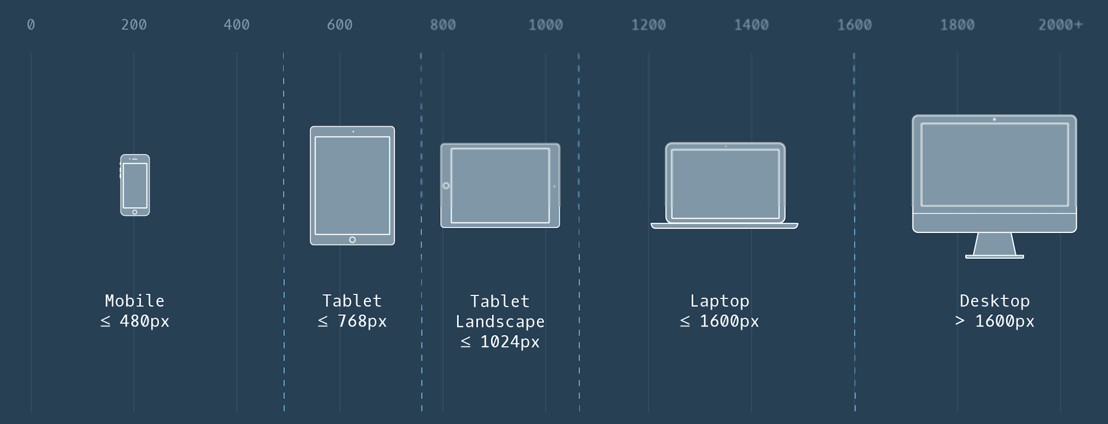
The style without the media query is the smallest and the default style. The style inside the media query is the one for the larger screens and will overwrite the default style if the screen where the website is displayed is larger than specified.
← Grid Transition →