# Grid
- css-tricks.com - Things I’ve Learned About CSS Grid Layout (opens new window)
- css-tricks.com - A complete guide to CSS Grid (opens new window)
- Learn CSS Grid - scrimba (opens new window)
- Why CSS Grid is better than Bootstrap (opens new window)
- Moving From CSS Frameworks To CSS Grid (opens new window)
- gridbyexample (opens new window)
- jensimmons (opens new window)
- Rachel Andrews (opens new window)
- Grid - MDN (opens new window)
- Specification w3.org (opens new window)
- Game: Grid Garden (opens new window)
- cssgrid.io (opens new window)
# Creating a Grid
=> defining the Parent/Container
To set up a grid, you need to have both a grid container (parent) and grid items (children).
To turn an HTML element into a grid container:
display: grid;ordisplay: inline-grid;
Direct child element(s) of the grid container automatically become grid items.
# Creating Columns & Rows
Define the Columns & Rows (Number & Size): grid-template: rows / columns;
Or : grid-template-columns or grid-template-rows (By default, the rows are sized to fit evenly inside the grid.)
grid-template: 200px 300px / 20% 10% 70%;
# Fraction
By using the fr unit, we can define the size of columns and rows as a fraction of the grid’s length and width.
grid-template: 2fr 1fr 1fr / 1fr 3fr 1fr;
It is possible to use fr with other units as well. Each fr represents a fraction of the available space.
grid-template-columns: 1fr 60px 1fr;
# Repeat
The repeat function will duplicate the specifications for rows or columns a given number of times.
grid-template-columns: repeat(3, 100px);
grid-template-columns: repeat(2, 20px 50px)
grid-template-columns: repeat(5, 1fr)
# minmax
to prevent a row or column from getting too big or too small
grid-template-columns: 100px minmax(100px, 500px) 100px;
In this example, the first and third columns will always be 100 pixels wide, no matter the size of the grid. The second column, will vary in size (between 100 and 500 pixels) as the overall grid resizes.
# Grid Gap
will put blank space between every row and column in the grid
grid-gap: 20px 10px;
will set the distance between rows to 20 pixels and the distance between columns to 10 pixels. Unlike other CSS grid properties, this shorthand does not take a / between values!
Also: grid-row-gap and grid-column-gap
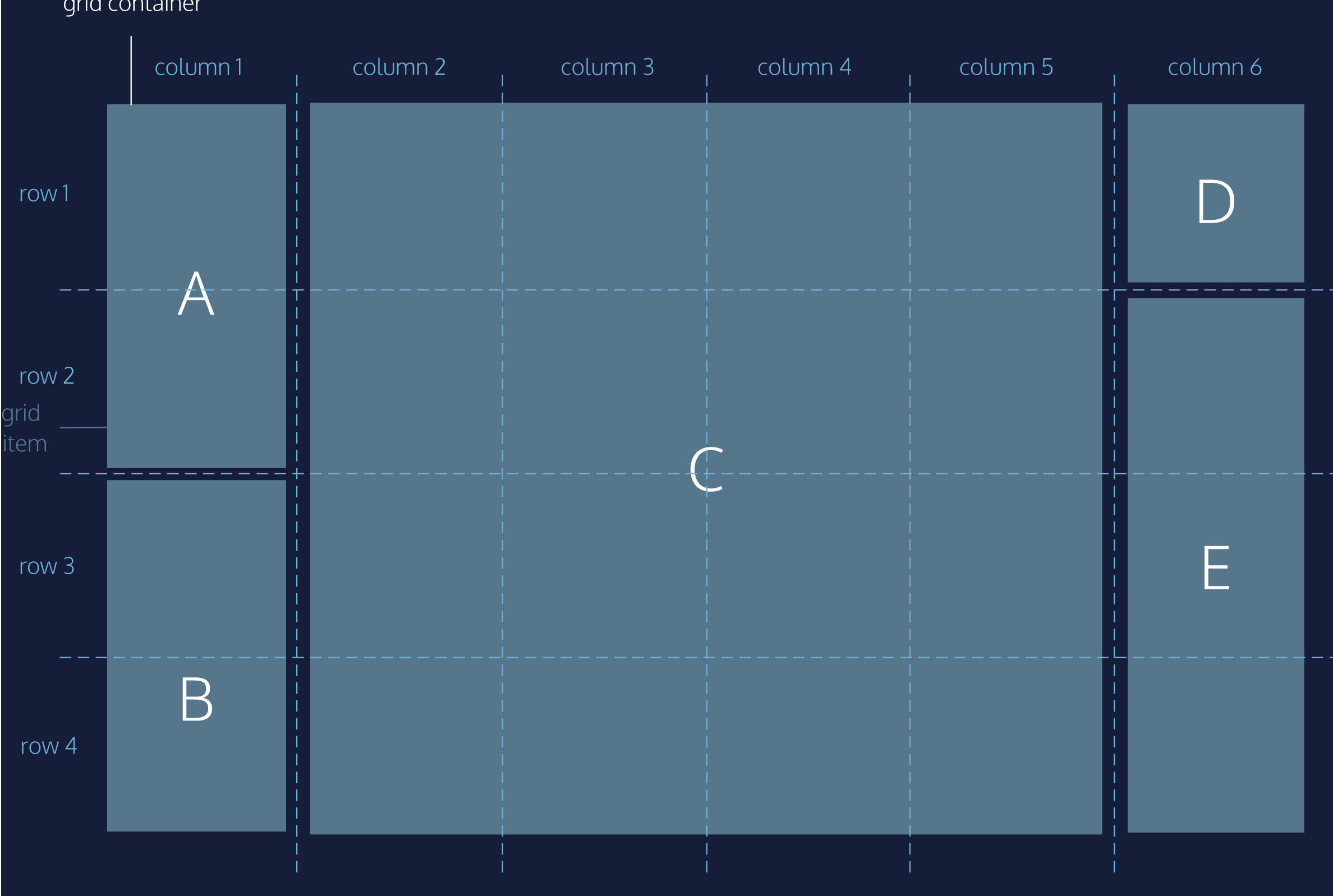
# Defining the Grid Items
we can make grid items take up more than one row and one column. In the diagram: Items A, B, C, and E span more than one row
# Grid Area
grid-area (opens new window) is a shorthand for grid-row-start (opens new window), grid-column-start (opens new window), grid-row-end (opens new window) and grid-column-end (opens new window), all in one line:
grid-area: 2 / 3 / 4 / span 5;
grid-area takes four values separated by slashes:
- grid-row-start
- grid-column-start
- grid-row-end
- grid-column-end
grid lines start at 1 and end at a value that is 1 greater than the number of rows or columns the grid has
The value for start should be the row/column at which you want the grid item to begin. The value for end should be one greater than the row/column at which you want the grid item to end
It is possible for the start-value to be greater than that end-value. Both properties can also each have negative values
use the keyword
spanto start or end a column or row relative to its other endgrid-column: 4 / span 2;it will also include the grid-gap if any exists.
grid-rowandcolumn-roware also available.the starting row goes before the “/“ and the ending row goes after it.
# Grid Template Areas
grid-areacan also be used to assign names to grid items.- Named grid items can be referred to by the
grid-template-areasproperty of the grid container. - To name sections of your web page.
- -> gibt namen für die linien zwischen den columns
- specifies grid named grid areas
- Use as values in the grid-row-start, grid-row-end, grid-col-start,grid-col-end, and grid-area properties
.item1 { grid-area: header; }
.item2 { grid-area: menu; }
.item3 { grid-area: main; }
.item4 { grid-area: right; }
.item5 { grid-area: footer; }

.grid-container {
  grid-template-areas:
    'header header header header header header'
    'menu main main main right right'
    'menu footer footer footer footer footer';
}
grid-template-columns:
  [full-start] 1fr
  [content-start] 30em
  [content-end] 1fr
  [full-end];
# Overlapping Elements
When overlapping elements, it is generally easiest to use grid line names and the grid-area property.
# Justify and Align Items/Content
- The column/block axis stretches from top to bottom across the web page.
- The row/inline axis stretches from left to right across the web page
# Justify Items - Align Items
justify-items positions grid items along the inline (row) axis -> from left to right
align-items positions grid items along the block, or column axis -> from top to bottom.
This property is declared on grid containers.
align-items specifies how individual elements should spread across the column axis
justify-items specifies how individual elements should spread across the row axis
Values:
start — aligns grid items to the left/top side of the grid area
end — aligns grid items to the right/bottom side of the grid area
center — aligns grid items to the center of the grid area
stretch — stretches all items to fill the grid area
# Justify Content - Align Content
position the entire grid
justify-content position the entire grid along the row axis -> from left to right
align-content positions the rows along the column axis -> from top to bottom
align-content specifies how groups of elements should spread across the column axis
justify-content specifies how groups of elements should spread across the row axis
Values:
start — aligns the grid to the left side/top of the grid container
end — aligns the grid to the right side/bottom of the grid container
center — centers the grid horizontally in the grid container
stretch — stretches the grid items to increase the size of the grid to expand across the container
space-around — includes an equal amount of space on each side of a grid element, resulting in double the amount of space between elements as there is before the first and after the last element
space-between — includes an equal amount of space between grid items and no space at either end
space-evenly — places an even amount of space between grid items and at either end
# Justify Self - Align Self
justify-self specifies how an individual element should position itself with respect to the row axis. This property will override justify-items for any item on which it is declared.
align-self specifies how an individual element should position itself with respect to the column axis. This property will override align-items for any item on which it is declared.
* align-self specifies how a single element should position itself with respect to the column axis
justify-self specifies how a single element should position itself with respect to the row axis
Values:
- start — positions grid items on the left side/top of the grid area
- end — positions grid items on the right side/bottom of the grid area
- center — positions grid items on the center of the grid area
- stretch — positions grid items to fill the grid area (default)
# Implicit vs. Explicit Grid
The implicit grid is an algorithm that determines default behavior for the placement of elements when there are more than fit into the grid specified by the CSS. * grid-auto-rows specifies the height of rows added implicitly to the grid * grid-auto-columns specifies the width of columns added implicitly to the grid Default behavior of the implicit grid is:
- items fill up rows first, adding new rows as necessary.
- New grid rows will only be tall enough to contain the content within them.
grid-auto-rows and grid-auto-columns. specify the size of grid tracks added implicitly. These properties are declared on grid containers.
They accept the same values as their explicit counterparts, grid-template-rows and grid-template-columns
- pixels (px)
- percentages (%)
- fractions (fr)
- the repeat() function
# Grid Auto Flow
* grid-auto-flow specifies in which direction implicit elements should be created
In addition to setting the dimensions of implicitly-added rows and columns, we can specify the order in which they are rendered. grid-auto-flow specifies whether new elements should be added to rows or columns Values.
- row — specifies the new elements should fill rows from left to right and create new rows when there are too many elements (default)
- column — specifies the new elements should fill columns from top to bottom and create new columns when there are too many elements
- dense — this keyword invokes an algorithm that attempts to fill holes earlier in the grid layout if smaller elements are added
You can pair row and column with dense, like this:
grid-auto-flow: row dense;
This property is declared on grid containers.